Inside the French Grammar Notion Template: A Visual Walkthrough
A screen-by-screen tour of the French Grammar Notion template: how the dashboard, rule library, error log, and review system fit together before you commit.
Templates are hard to judge from a thumbnail. You see a pretty cover image and a feature list, but you can't tell whether the thing actually fits how you study. This is a plain-English walkthrough of what the French Grammar Notion template looks like once it's open, page by page, so you know exactly what you're getting before you duplicate it.
Think of it as a guided tour rather than a sales page. Every section below maps to a real part of the template.
The dashboard: your home base
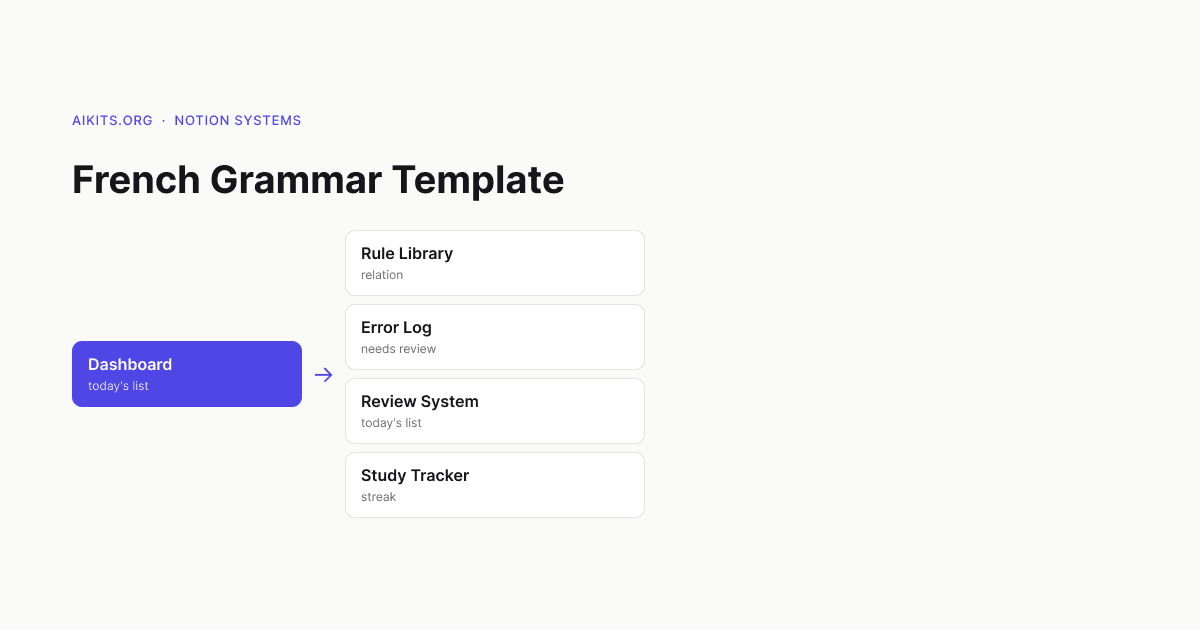
The first thing you land on is the dashboard. It's deliberately uncluttered: a short welcome block, a row of quick-action buttons, and three linked views pulled from the databases underneath.
The design principle here is one screen, one decision. When you open the template, you should immediately know what to do next — not face a wall of databases. So the dashboard surfaces three things: what to review today, your current focus topic, and a quick-add button for logging a new mistake. Everything else lives one click deeper.
If you've ever abandoned a Notion template because opening it felt like opening a control panel, this is the part that addresses that.
The Rule Library
Next is the Rule Library — a database with one row per grammar concept. Each entry has a clean, consistent layout: the rule stated in one sentence, two or three example sentences, the common mistake learners make, and a difficulty tag.
The useful part is the views. There's an A–Z view for looking something up fast, a By topic board (tenses, pronouns, agreement, subjunctive, prepositions), and a Trouble spots view filtered to the rules you've flagged as shaky. So the same library serves two modes: reference when you're stuck, and study when you're drilling.
Visually, each rule page opens to the same template, so once you've read one you can read them all without re-learning the layout. Consistency is the quiet feature that makes a reference actually get used.
The Error Log
This is the engine room. The Error Log is where you record sentences you got wrong, with the correction, the rule it relates to, and a review counter.
On screen it's a simple table, but the magic is the linked relation back to the Rule Library. When you log a mistake and tag it to a rule, that rule's page shows every error you've ever made against it. Over time you can open "Subjunctive" and see your personal history with it — which is far more motivating than a static explanation.
The Needs Review view sorts your unmastered errors so the freshest mistakes sit on top. That's the list the dashboard pulls from each day.
The review system
The template doesn't bolt on a complicated spaced-repetition algorithm. Instead it uses a count-and-checkbox approach you can see and trust: each correct recall bumps a counter, and three correct recalls tick a Mastered box, which removes the item from your review queue.
Visually this means your review list shrinks as you improve, which is the feedback you want. A growing pile is demoralising; a shrinking one pulls you back tomorrow. The whole system is legible — you can look at any row and understand exactly why it's in your queue or out of it.
The study tracker
The last main page is a lightweight habit tracker: one row per study day, with date, minutes, and the topic you focused on. It exists to answer one question at a glance — have I shown up this week?
A small calendar view gives you the streak picture without turning study into a guilt machine. There's no scoring, no judgement, just a record. Seeing a week of filled-in days is enough.
What the visuals tell you about the template
Walking through it screen by screen, a few design choices stand out, and they're the things worth knowing before you commit:
- It's minimal on purpose. Few properties, few views, lots of white space. It's built to be maintained daily, not admired once.
- Everything connects. Rules, errors, and reviews are linked, so logging a mistake automatically enriches the rest of the system.
- It assumes you'll use it forever, not finish it. There's no "end." It's a loop you keep running.
Should you duplicate it?
If you've seen the walkthrough and your reaction is "that's fewer features than I expected," that's the correct reaction — and the point. The template wins by being light enough to open every day. If you want a maximalist dashboard with twenty databases, this isn't it. If you want a quiet system that actually fits a 15-minute daily habit, the tour above is exactly what you'll get when you click duplicate.