My Spanish Study Notion Dashboard, Revealed
A full walkthrough of the Notion dashboard I use to study Spanish: the databases, the daily view, the spaced-repetition setup, and the design choices that keep me coming back.
I have rebuilt my Spanish study setup in Notion more times than I want to admit. The first version was a single endless page. The second was a wall of databases I never opened. The one I actually use every day is the third, and it is deliberately small. This is a tour of exactly what is in it and why each piece earns its place.
If you have been collecting screenshots of pretty language dashboards and wondering what is actually behind them, this is the unglamorous, working version.
The homepage: one screen, one decision
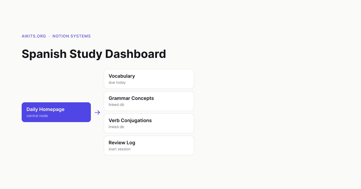
The whole point of the dashboard is that when I open it, I should know what to do in under five seconds. No scrolling, no scanning, no "where was I."
The homepage has four things, top to bottom:
- Today's study queue — a linked view of cards due for review, filtered to today.
- A single "Start a 15-minute session" button — a Notion button block that opens my session template.
- This week's grammar focus — one callout block I update on Mondays.
- A streak counter — a simple number I bump manually, because automating it was more trouble than it was worth.
Everything else lives one click deeper. The homepage is a launcher, not a library.
The databases behind it
Four databases do all the work. I resisted adding a fifth for a year and I am glad I did.
1. Vocabulary
The core. Each entry is one word or phrase with these properties:
- Term (Spanish) and Meaning (English)
- Example sentence — always in Spanish, ideally one I encountered in the wild
- Part of speech (select)
- Tags (multi-select: travel, work, idioms, false friends)
- Next review (date) and Interval (number)
- Source — where I found it, so I can trust the context
The rule I follow: no word goes in without an example sentence. A word in isolation is a flashcard you will fail. A word inside a sentence is a memory with a hook.
2. Grammar concepts
Separate from vocabulary because grammar is studied differently — you do not drill it, you understand it and then practice it. Each entry has the concept name, a plain-English explanation in my own words, two or three example sentences, and a relation to the vocabulary that uses it. Subjunctive triggers, ser vs. estar, por vs. para — they each get one page.
3. Verb conjugations
Verbs deserve their own database because the structure is different: one verb, many forms. Each verb page holds a small table of tenses I care about (present, preterite, imperfect, subjunctive present) and a flag for whether it is irregular. I do not try to memorize a conjugation chart cold; I link irregular verbs to the vocabulary cards where they actually appear.
4. Review log
This is the quiet hero. Every study session creates one entry: date, minutes, what I covered, and how it felt (a one-to-five select). It takes ten seconds to fill in. Over months it became the single most motivating part of the dashboard, because a calendar view of green dots is more honest than any streak app.
How spaced repetition works without a plugin
Notion has no native spaced-repetition engine, so I fake it with two properties and a habit.
Each vocabulary card has Next review and Interval. When I review a card and get it right, I push the date forward and roughly double the interval (1 day, 3 days, 7 days, 16 days, and so on). When I get it wrong, I reset the interval to 1 and the date to tomorrow. I do this manually inside the card.
Is manual updating less elegant than an automated formula? Yes. But the act of choosing "got it" or "missed it" is itself a moment of retrieval, and it keeps me honest about what I actually know. A filtered view called "Due today" surfaces only the cards where Next review is on or before today, sorted by oldest first.
If you want this automated, a Notion formula can compute the next interval, but you still have to click something — so I skip the formula.
The daily session template
The "Start a 15-minute session" button creates a new Review log entry pre-filled with today's date, and the template body is a short checklist:
- Clear today's due vocabulary queue
- Read one grammar concept page out loud
- Write two original sentences using this week's focus
- Log how it felt
Fifteen minutes, four steps, done. The constraint is the feature. A two-hour study plan gets skipped; a fifteen-minute one gets done on a Tuesday when I am tired.
Design choices that actually mattered
A few small decisions had outsized effects on whether I kept using it:
- One accent color, lots of whitespace. A busy dashboard feels like work before you have done any work.
- Views, not new pages. Every database is created once and surfaced through filtered linked views. I never navigate into a raw database table during study.
- Hide what you are not using right now. Toggle blocks keep the homepage to one screen. The library is there, but folded away.
- Mobile first for review, desktop for editing. I review on my phone in line at the coffee shop and only do setup on a laptop.
What I would tell my past self
Start smaller than feels responsible. You do not need a beautiful template with twelve databases — you need a vocabulary list with example sentences, a way to see what is due today, and a log that proves to you that you showed up.
The dashboard does not teach you Spanish. The fifteen minutes do. The dashboard's only job is to make those fifteen minutes frictionless enough that you take them. Build for that, and ignore everything else.
If you want a head start, you can replicate this structure in an afternoon: four databases, four filtered views, one button, one log. Then spend your energy filling it with real words from real sentences — that is where the learning lives.